
landscapes
same print, different inks
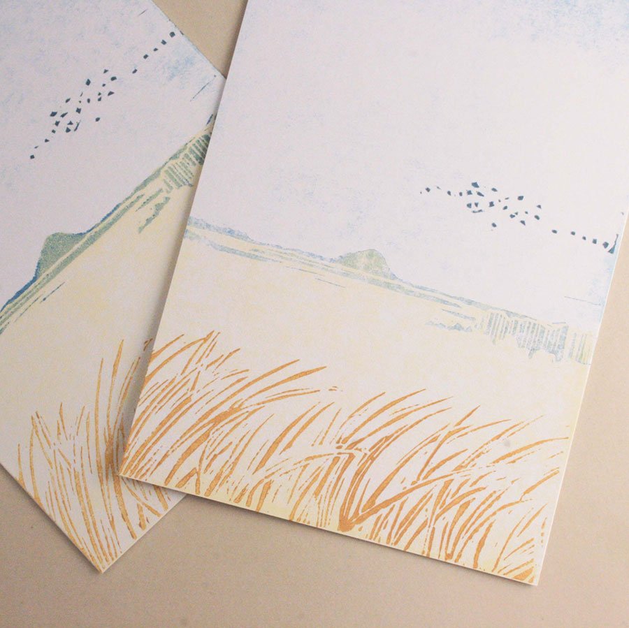
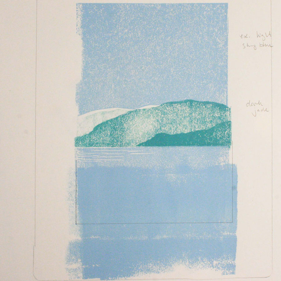
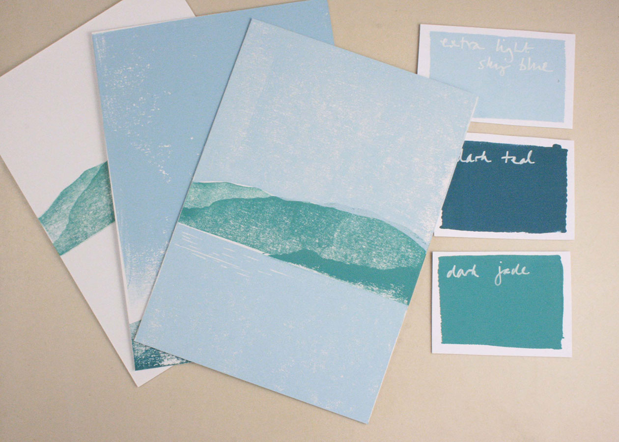
It's astonishing how much it can change the atmosphere of a print, just by changing the colours slightly.
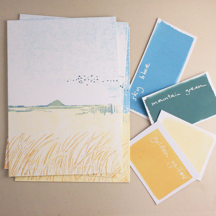
When an image is being carved, it's easy to focus on the composition, and the layers, but in fact, the element which takes time & nuance is the colour combination.
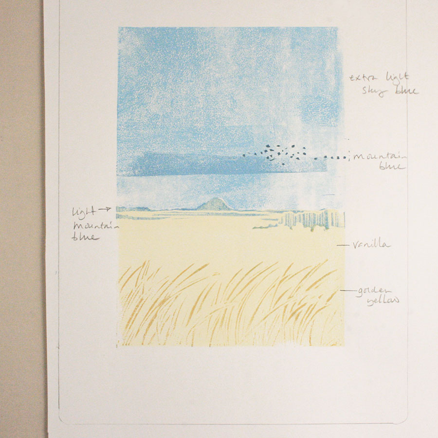
Each print is sampled on paper first & notes are made.
It's easy to forget which colour is which.
This print is inspired by the view back to North Berwick Law from Gullane, in East Lothian, Scotland.
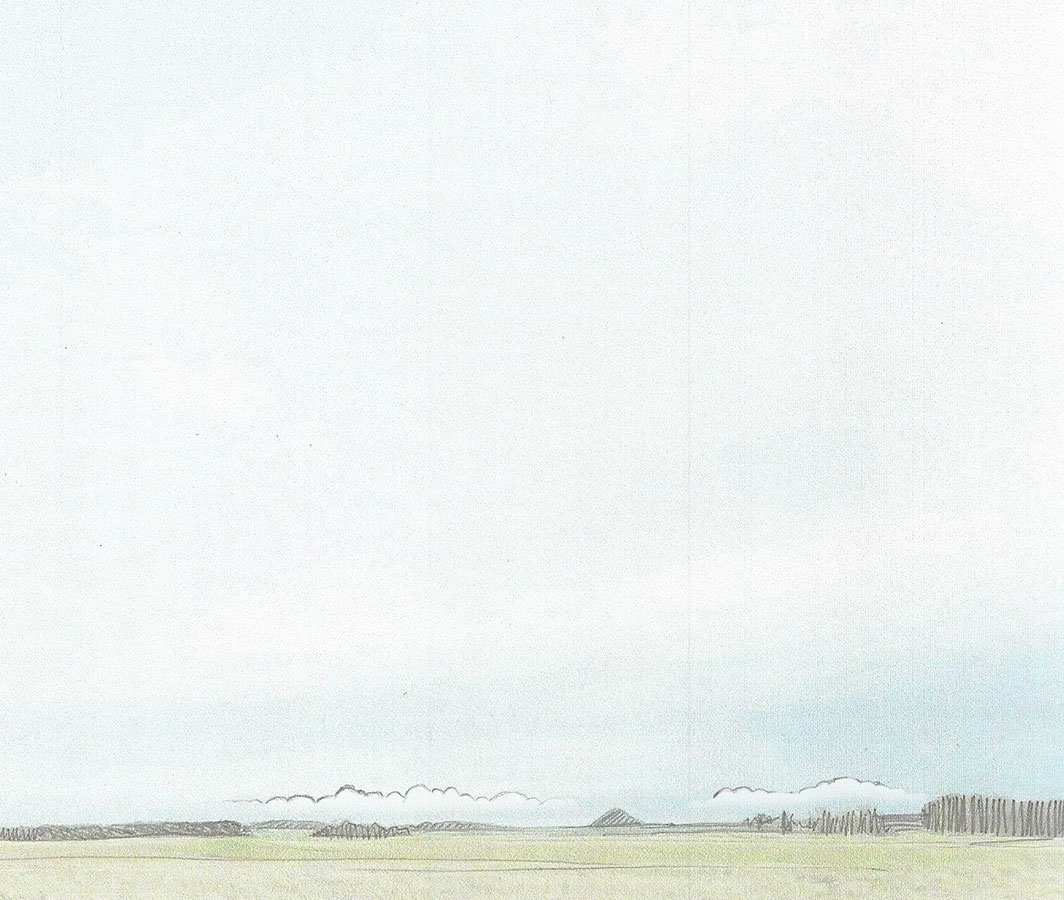
After taking photos on location, I then printed my favourites & scribbled over the top, considering which composition I liked best.
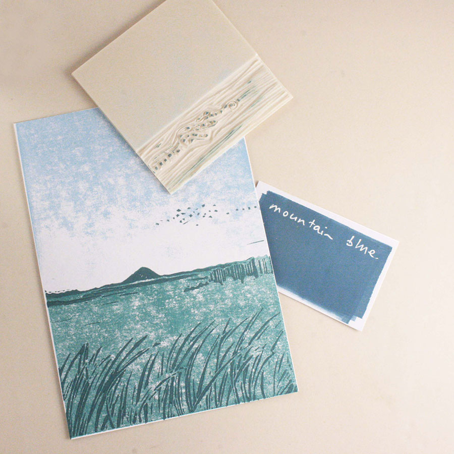
Then I began messing about with colours.
The colour combination above, quite by accident, felt like the gloaming, and didn't quite capture the light, that is so magical in East Lothian.
So by changing the colours & messing about with tone, over printing & ghost printing* I ended up creating several different versions of the same image.
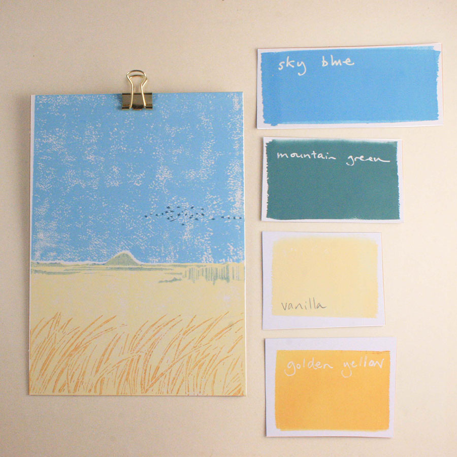
Whilst the bright colours in the print above are lovely, they didn't capture that atmosphere the way I had hoped.
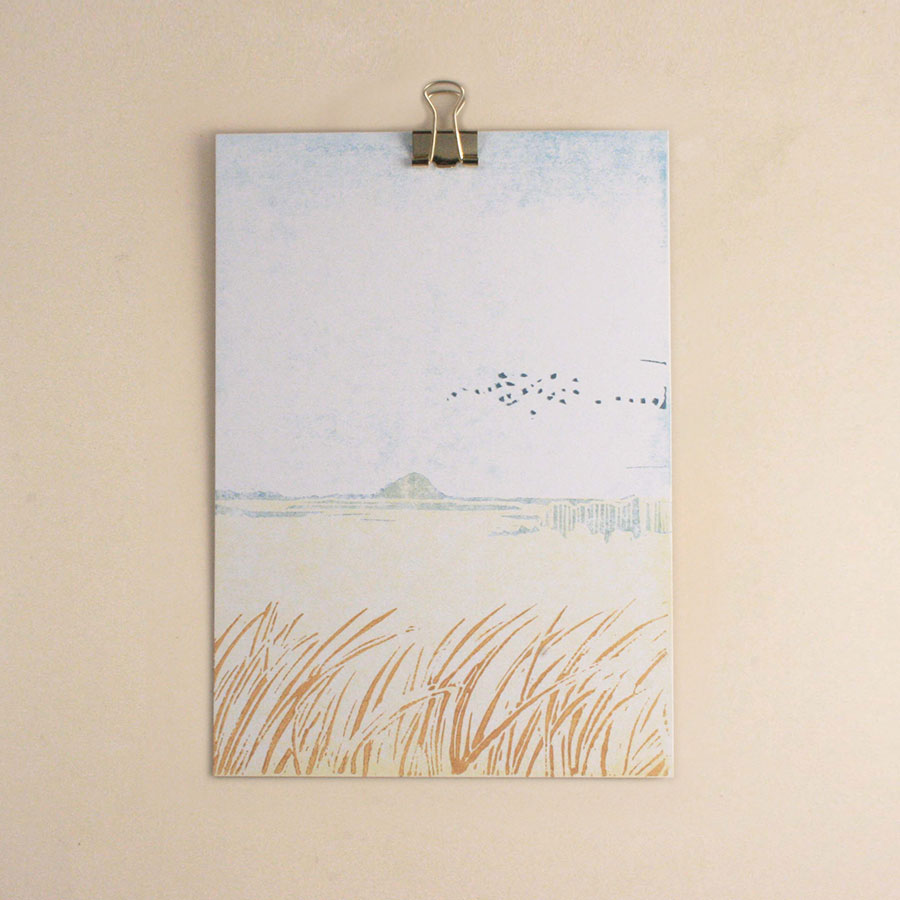
The print pictured above ended up being my favourite. I love the way 'The Law'** sits quietly in the distance with the birds dancing in the sky.
When you join me for a class, we'll have a lovely time messing about with inks & colours to see which combination you like best. After all, we are all different, just like the prints.
In the Lake District prints below...
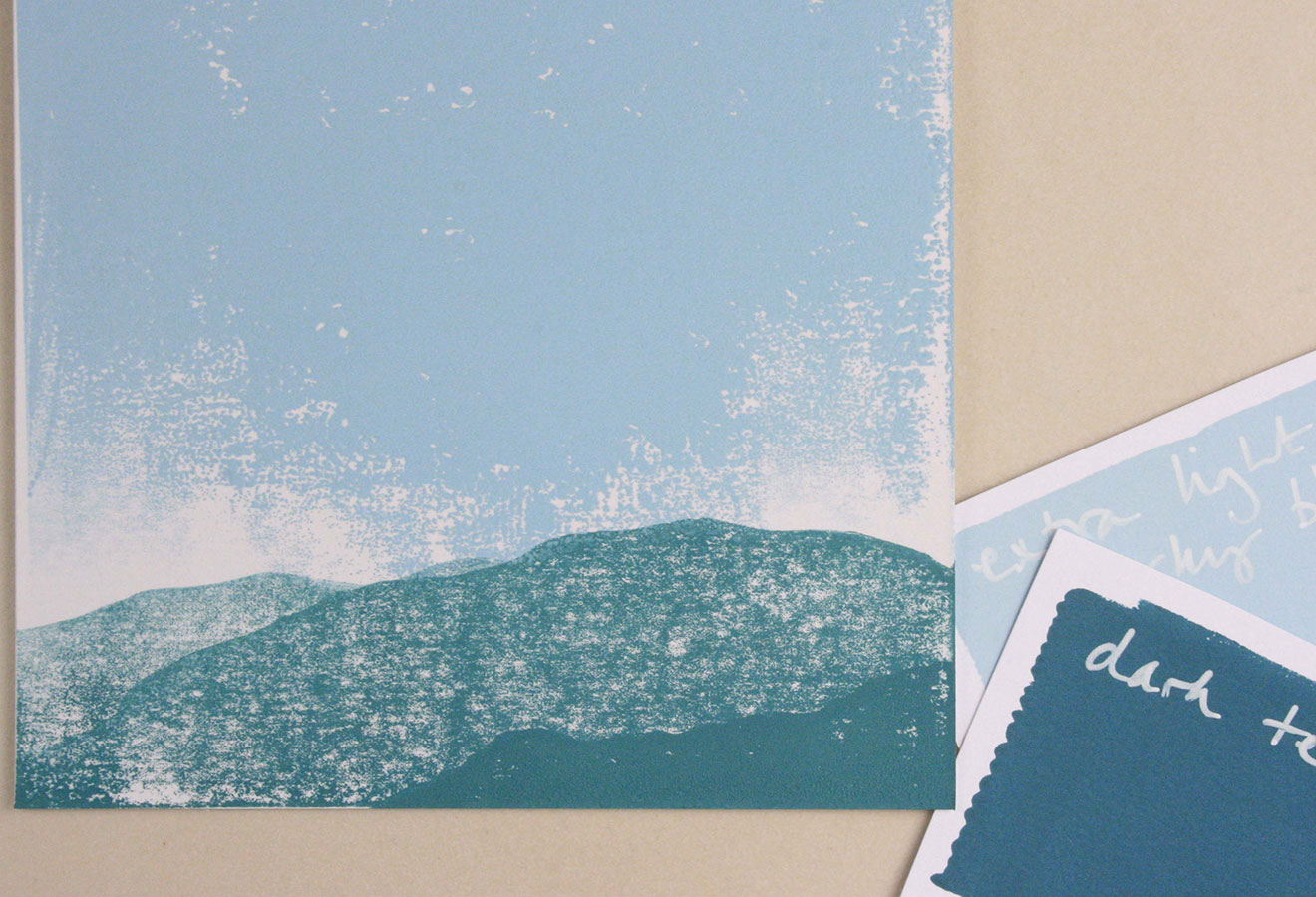
It's interesting to see how different the atmosphere is, just by changing the colours slightly.
It's a lovely way to spend a few hours, just messing about with colours.
You'll love it, I know you will.
